Once you have set up your widget, you can quickly and easily make any required changes through the widget settings.
You can easily navigate to your widget settings by going to Settings → Widgets. Once there, you can click on the name of the widget you want to edit.
Widget Customization & Styling
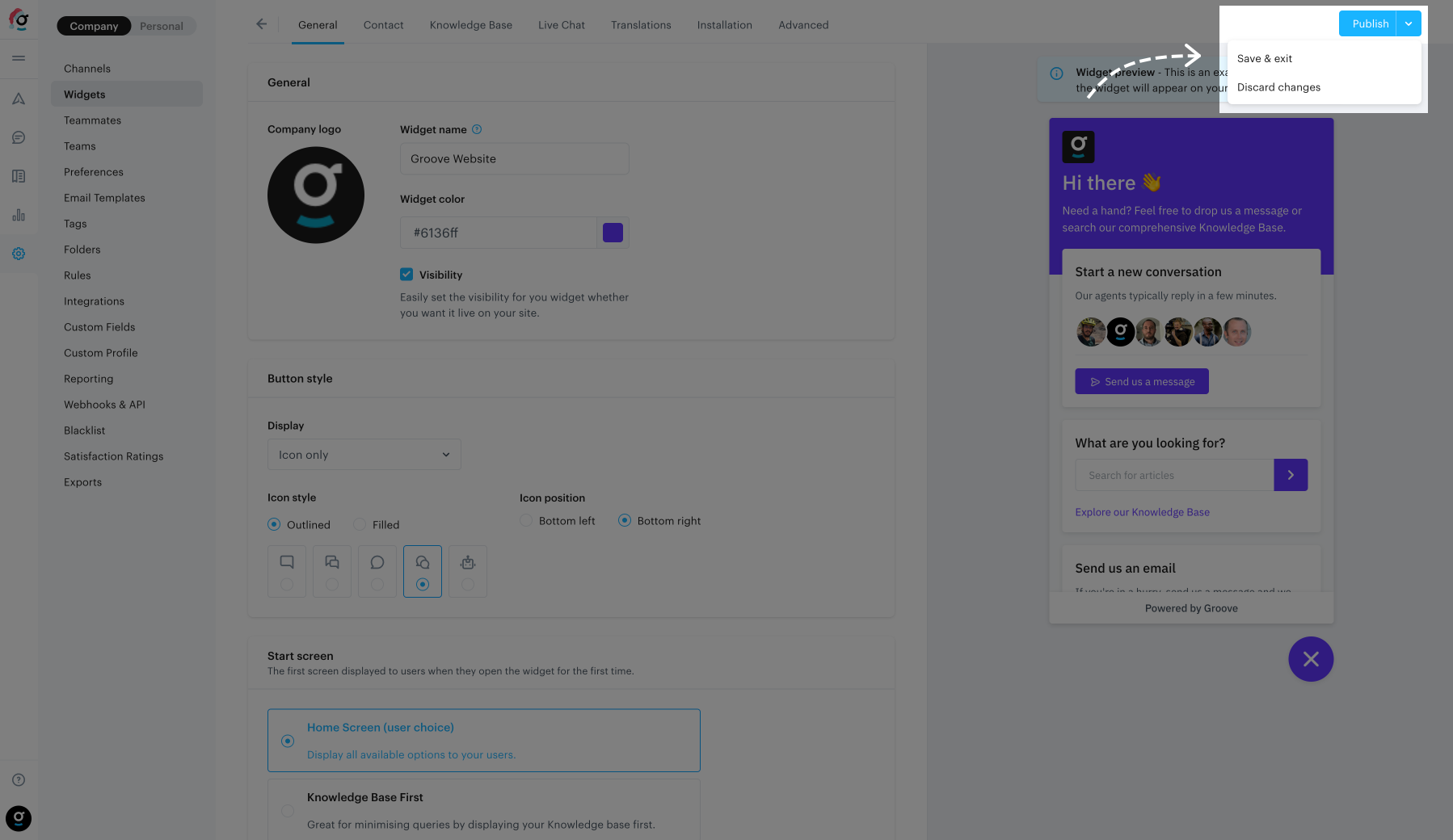
When making changes to your widget, all visible changes will be automatically displayed in the live preview on the right of your browser. Don’t worry: the changes shown in the live preview will only be applied when you publish your changes.
If you’ve decided not to go forward with your changes you can discard them by clicking Discard changes by pressing the drop down next to the Publish button.
Changing your widget name
This is the internal name that you can use to identify your widget in the Groove settings screens. This is not displayed at all on your Widget and will never be shown to your customers.
Enabling/Disabling the visibility of your widget
If you would like to temporarily disable the widget from displaying on your website, you can toggle the Visibility option.
Adding your company logo
You can add your company logo which will be displayed at the top left corner of your widget on whichever Start Screen you have set. The requirements are:
Images should be in either PNG or JPG format.
The ideal aspect ratio is 2:1, with ideal dimensions being 100px by 100px.
The max file size supported is 1MB.
Changing your widget color
Here you can use the color picker to set the color of your widget. You are only able to select the one primary color used for the primary header container, links, buttons, and the widget badge.
Setting the widget badge (icon)
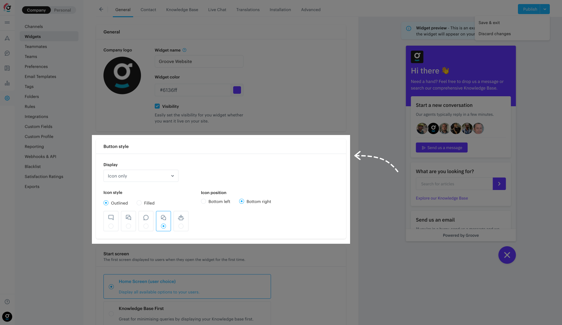
The widget badge is the button which is displayed in the bottom corner of your website. The badge will always display an “×” icon when the widget is open, which cannot be changed.
Display options
You can choose how you want the widget badge to appear with the following options:
Icon: Displays just the logo.
Text: Displays only text in the badge, no logo.
Icon and text: Displays both icon and text in the badge.
Icon styles
Here you can set what icon you would like displayed in your widget and whether you want just the outlines or a filled icon.
Position options
Here you can choose whether you want the widget badge to be placed in the bottom left or right of your website.
Badge text
Here you can add in the text that your badge will display.
Note: If the wording is too long for the available screen space allowed for the badge (like on mobile) we will place in ellipsis (…) in place of missing wording.
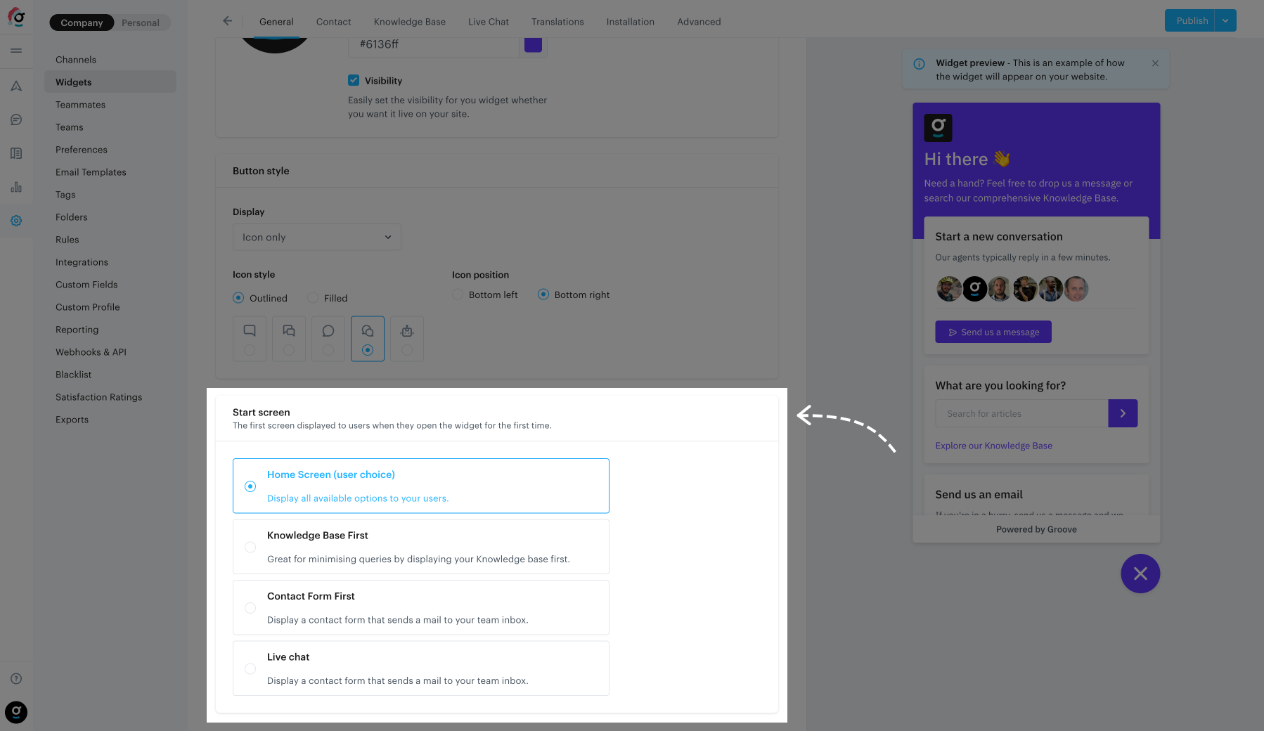
Start screen
Note: you will only see this panel if you have both the Knowledge Base and contact forms enabled.
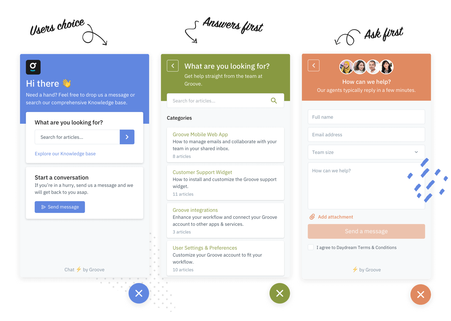
If you enable both your Knowledge Base and your contact form, you can specify the start screen that users see when they first open up your Widget. Users will always be able to navigate to the home screen, regardless of which start screen you choose.
Start screen options
Home Screen: This displays a Home Screen where the user can select to either go to the Contact Form or Knowledge Base.
Contact Form: This displays the contact form first, with a button to navigate to the home screen.
Knowledge Base: This displays the Knowledge Base first, with a button to navigate to the home screen.
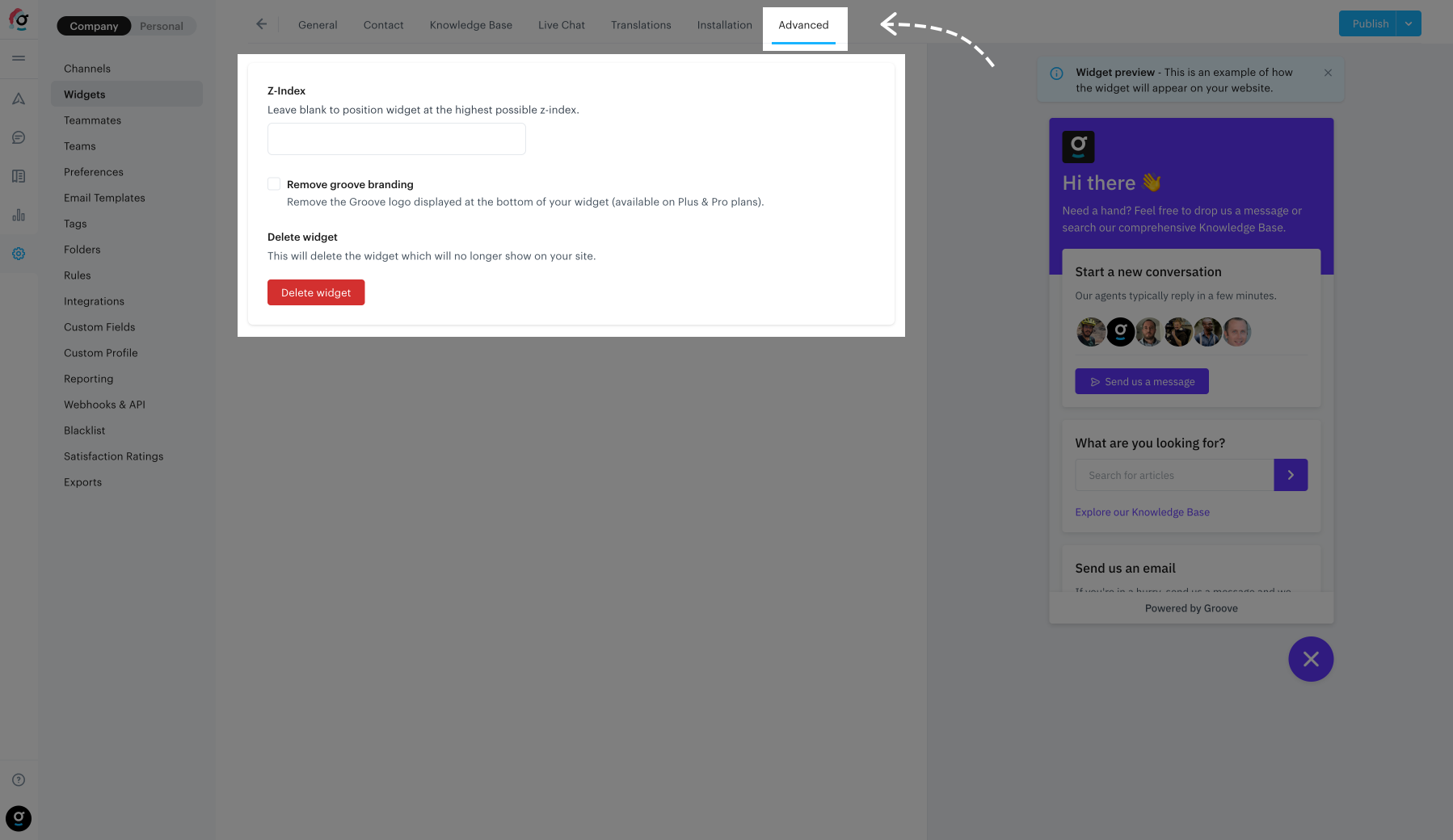
Advanced options
Z-index: This sets the widget z-index CSS property as it’s displayed on your website.
Groove branding: Here you’ll be able to disable the “Powered by Groove” logo on the bottom of your widget when it’s open (only available on Plus & Pro accounts).
Delete Widget: If you would like to permanently delete your widget you can delete it here. When selecting this option, you will first be presented with a confirmation screen. Important: Deleted widgets cannot be recovered at all.